MapsGL - Styling Weather Data
The benefit of MapsGL over raster-based image tile offerings is that everything is rendered in the browser, meaning you have complete control over the styling of your weather layers. When adding weather layers to your map via the map controller, you can provide a second argument to addWeatherLayers to include any overrides you want on top of the default data and styling configurations.
There are essentially two approaches to styling weather layers: basic and advanced.
Basic Style Overrides
Overriding basic paint style properties of weather layers are the most straightfoward and can result in a unique variety of weather visualizations. These include style properties like fill and stroke color, sample color scales, opacity, and more.
Sample Fill
Sample fill renderers are configured with a color scale and interval, where you provide value, color pairs to define the color stop positions and color values. The underlying data from the source is then sampled and the configured color scale is applied and rendering data to the map. Sample fills weather layers include most gridded datasets, such as temperature, wind speed, dew point, precipitation, etc. All weather layers whose type is sample uses this render style and can be customized.
For instance, you want to render temperatures with a custom color scale at a lower data quality and using a different interval, such as every 2 degrees F instead of the default of 0.1 degree F. You would just need to provide the necessary configuration overrides for the data and sample paint style options for your needs:
// create a reference to the FtoC unit value converter since MapsGL data units
// are defined in Metric values (e.g., temperatures are in degrees Celsius)
const FtoC = aerisweather.mapsgl.units.FtoC;

map.addWeatherLayer('temperatures', {
    data: {
        quality: aerisweather.mapsgl.DataQuality.low
    },
    paint: {
        sample: {
            colorscale: {
                stops: [
                    FtoC(-90), '#e9c5f7',
                    FtoC(-50), '#f90c86',
                    FtoC(-20), '#d276bf',
                    FtoC(-10), '#6b41a7',
                    FtoC(0), '#e4e7ff',
                    FtoC(10), '#464ab5',
                    FtoC(20), '#3375ed',
                    FtoC(30), '#03f8f6',
                    FtoC(32), '#6bea99',
                    FtoC(45), '#19a00f',
                    FtoC(60), '#fdff87',
                    FtoC(80), '#cc2001',
                    FtoC(90), '#901436',
                    FtoC(100), '#e36f7e',
                    FtoC(110), '#ffbcff',
                    FtoC(120), '#b371c6',
                    FtoC(130), '#8a0f5f'
                ]
            }
        }
    }
});
Note in the above example how the FtoC utility function is being used. All data values for weather layers in MapsGL are defined in Metric units, which means your sample paint style configurations also need to use Metric units. If we’re more familiar with Imperial units and want to specify temperature color stops at even degree intervals in Fahrenheit, we can use the FtoC to perform the required conversion for us inline.
The above configuation will result in temperatures being rendered as below:
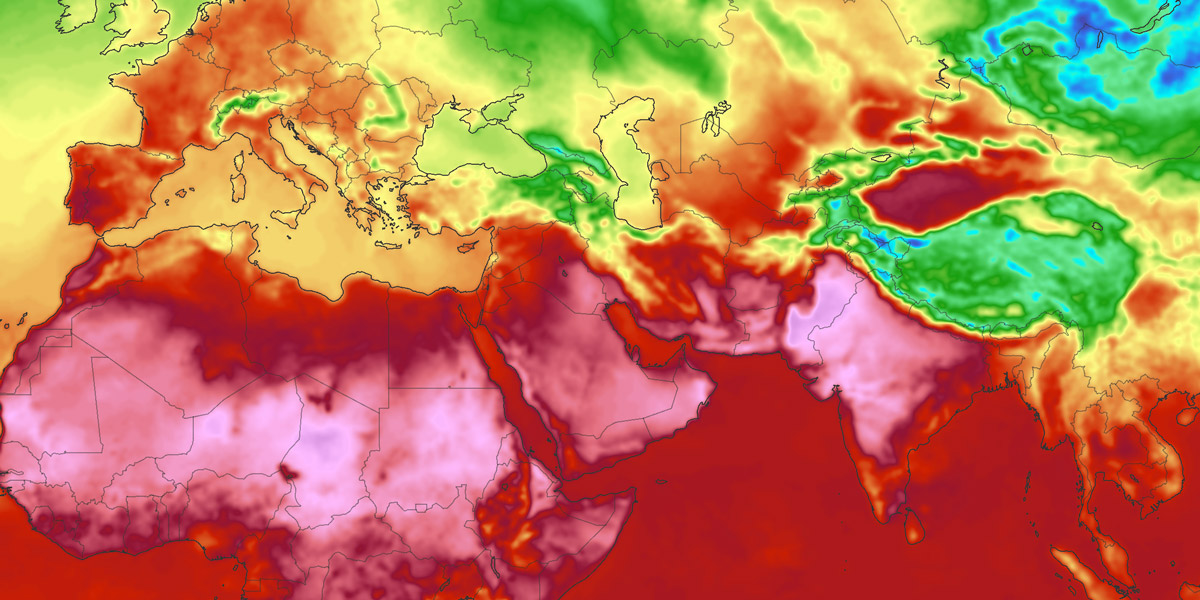
Notice how the color scale is smoothly interpolated between your configured color stops, producing a nice gradient of temperature information. But for this map you want a bit more differentiation between temperature values for a clearer visualization. You can override the default color scale interval of 0.1 degree F (0.0555 degree C) and use something like color stops every 2 degrees F (1.11 degrees C) instead:
map.addWeatherLayer('temperatures', {
    data: {
        quality: aerisweather.mapsgl.DataQuality.low
    },
    paint: {
        sample: {
            colorscale: {
                stops: [
                    FtoC(-90), '#e9c5f7',
                    FtoC(-50), '#f90c86',
                    FtoC(-20), '#d276bf',
                    FtoC(-10), '#6b41a7',
                    FtoC(0), '#e4e7ff',
                    FtoC(10), '#464ab5',
                    FtoC(20), '#3375ed',
                    FtoC(30), '#03f8f6',
                    FtoC(32), '#6bea99',
                    FtoC(45), '#19a00f',
                    FtoC(60), '#fdff87',
                    FtoC(80), '#cc2001',
                    FtoC(90), '#901436',
                    FtoC(100), '#e36f7e',
                    FtoC(110), '#ffbcff',
                    FtoC(120), '#b371c6',
                    FtoC(130), '#8a0f5f'
                ],
                interval: FtoC(2)
            }
        }
    }
});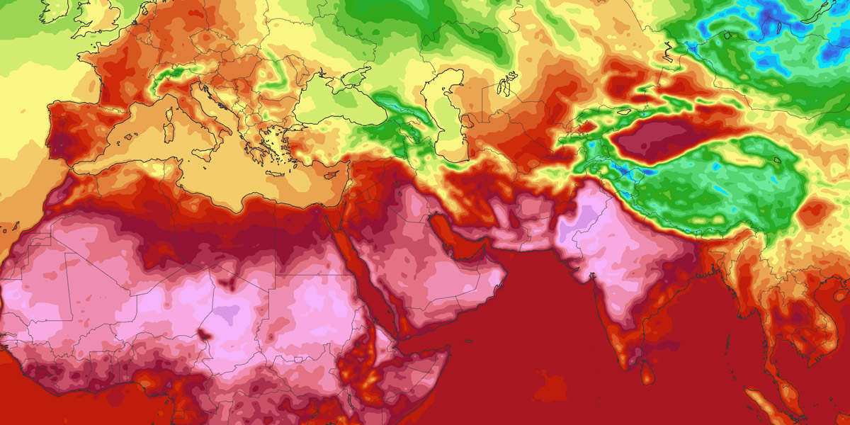
The above result is closer as we have more defined boundaries between temperature values. However, you want even more differentation and choose to increase the color stop interval to every 5 degrees F (2.775 degrees C) instead:
map.addWeatherLayer('temperatures', {
    data: {
        quality: aerisweather.mapsgl.DataQuality.low
    },
    paint: {
        sample: {
            colorscale: {
                stops: [
                    FtoC(-90), '#e9c5f7',
                    FtoC(-50), '#f90c86',
                    FtoC(-20), '#d276bf',
                    FtoC(-10), '#6b41a7',
                    FtoC(0), '#e4e7ff',
                    FtoC(10), '#464ab5',
                    FtoC(20), '#3375ed',
                    FtoC(30), '#03f8f6',
                    FtoC(32), '#6bea99',
                    FtoC(45), '#19a00f',
                    FtoC(60), '#fdff87',
                    FtoC(80), '#cc2001',
                    FtoC(90), '#901436',
                    FtoC(100), '#e36f7e',
                    FtoC(110), '#ffbcff',
                    FtoC(120), '#b371c6',
                    FtoC(130), '#8a0f5f'
                ],
                interval: FtoC(5)
            }
        }
    }
});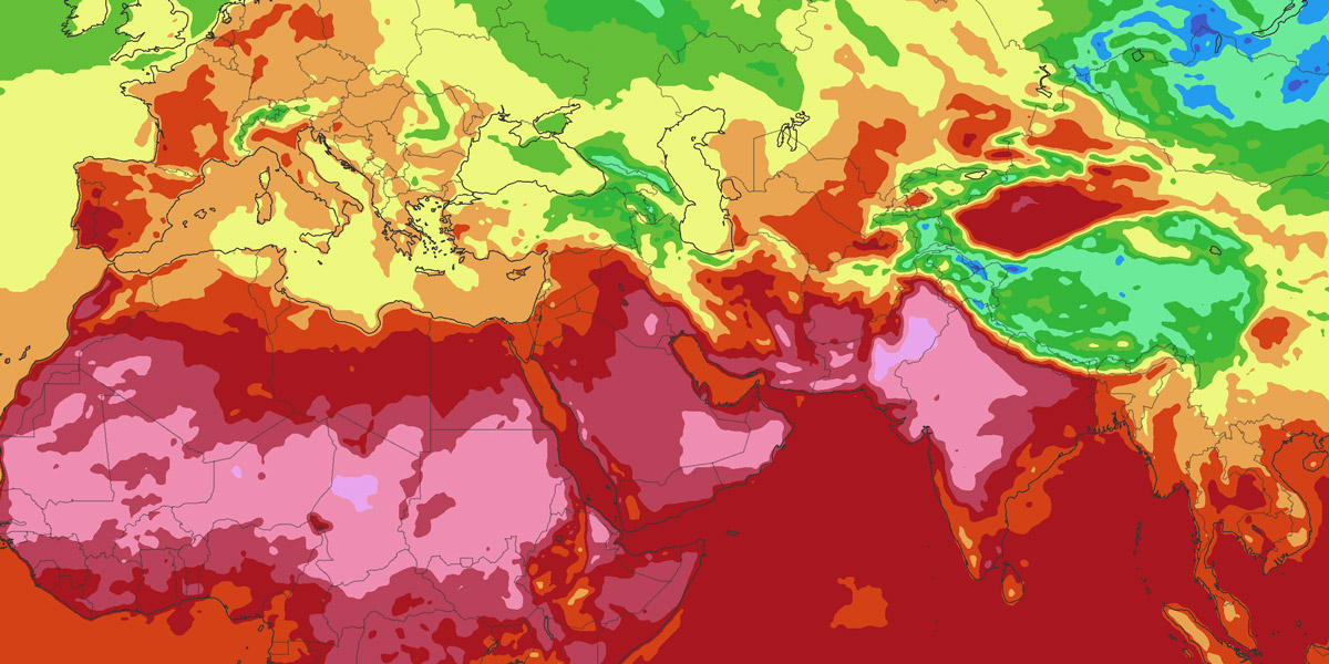
You can see how simply changing the color stop interval and result in drastically different visualizations, emphasizing the underlying weather story a bit differently.
Managing data level-of-detail
Use aerisweather.mapsgl.DataQuality to control the level-of-detail (LOD) for encoded and tile layers. When you omit data.quality (or layer quality), the SDK defaults to exact: data tiles are requested 1:1 with the map zoom.
Starting with MapsGL 1.10.0, that is also the default for sample-layer specs (previously high). Individual built-in weather layers can still set their own quality — for example some pressure layers use low and some radar/satellite layers use high. Forecast model layers always use exact.
| Option | Description | Default |
|---|---|---|
exact | Type: ()Highest quality. Data tiles render 1:1 with the map zoom. Uses the most bandwidth and can affect performance on constrained devices. | yes (when unspecified) |
high | Type: ()About three-quarters the resolution of exact per zoom level. Useful for radar or satellite when you want more detail than medium without a full 1:1 request. | |
medium | Type: ()Half the resolution of exact. A balance between detail and fewer tile requests. | |
low | Type: ()About one-quarter the resolution of exact. Useful when high detail is less necessary, such as surface-pressure, or on low-bandwidth devices. | |
normal | Type: ()Deprecated. Same as medium. | |
minimal | Type: ()Deprecated. Same as low. | |
Using this quality property allows you to increase or reduce the data resolution that gets rendered for a particular layer. For example, on a mobile device with low bandwidth or memory availability, you may want to chose a lower data quality setting so that less data is requested (e.g. fewer map tiles). The rendered output will still be smooth but with just less detail than a higher quality setting.
The following image compares temperatures at a low quality setting on the left and a high setting on the right for the same map zoom level:
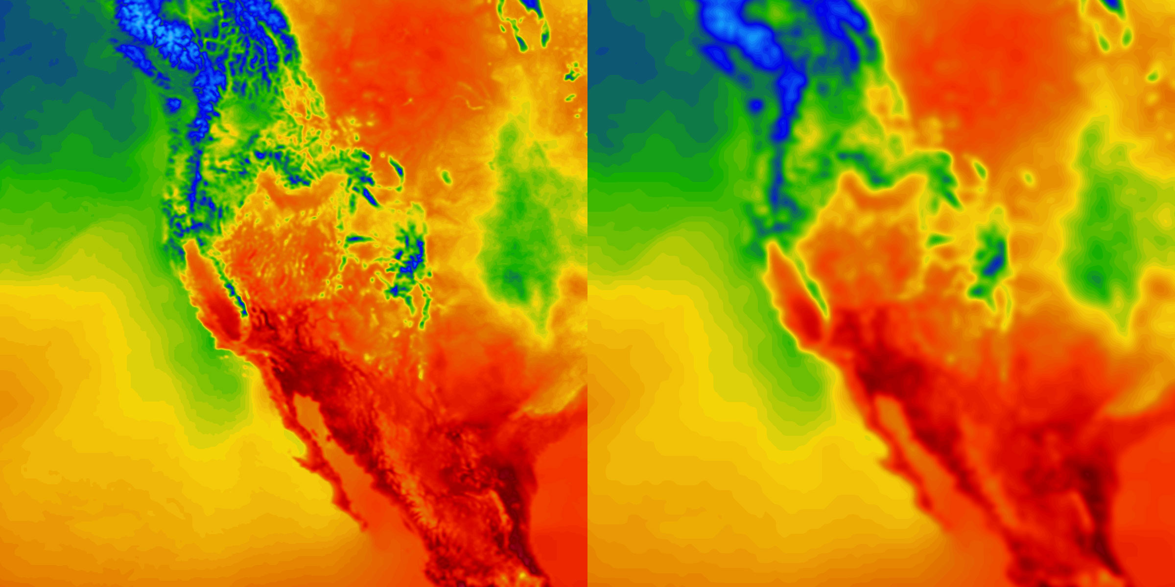
Also keep in mind that lower data quality settings will reduce the amount of data that gets request, thus lowering total network requests overall.
Advanced Style Overrides
While performing basic style overrides on weather layers provides an opportunity for uniquenss and differentiation with your weather data, perhaps you want to tell a completely different story than our default weather layers.
Sample Fill
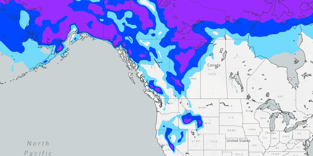
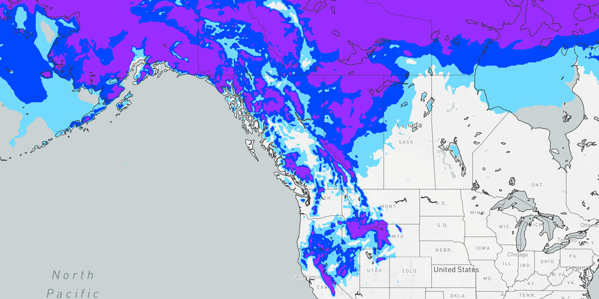
For example, an agriculture-focused application wants to include a temperature layer on their map that is strictly focused on temperatures that may affect plants and crops like frost and freeze information . So we start with the temperatures weather layer and provide a custom colorscale configuration for our sample fill with a color stop at each temperature value that defines the categorical temperature range (e.g. hard freeze, freeze, frost):
map.addWeatherLayer('temperatures', {
    paint: {
        sample: {
            drawRange: { max: FtoC(36) },
            colorscale: {
                stops: [
                    FtoC(-80), '#992BFF',
                    FtoC(28), '#0046FF', // hard freeze value stop
                    FtoC(32), '#73DAFC', // freeze value stop
                    FtoC(36), '#73DAFC' // frost value stop
                ],
                interpolate: false
            }
        }
    }
});
You will notice in the above code that we start our first color stop at -80 degrees F in order to color all values below 28 degrees F our hard freeze color. We are also setting a custom sample.drawRange with a max of 36 degrees F since we don’t want to render any temperature data whose value is greater than that max since we only care about freezing temperatures. We can omit a min value in the drawRange since we still want to render all data below 36 degrees F.
The color scale interpolation must also be disabled so that color values aren’t interpolated between the defined color stops and we want clear divisions between the three temperature categories. For this, we have set sample.colorscale.interpolate to false.
The above configuration will produce the following result:
The data quality could also be reduced to give a less-detailed visualization and more of a general outlook:
map.addWeatherLayer('temperatures', {
    data: {
        quality: aerisweather.mapsgl.DataQuality.minimal
    },
    paint: {
        sample: {
            drawRange: { max: FtoC(36) },
            colorscale: {
                stops: [
                    FtoC(-80), '#992BFF',
                    FtoC(28), '#0046FF',
                    FtoC(32), '#73DAFC',
                    FtoC(36), '#73DAFC'
                ],
                interpolate: false
            }
        }
    }
});