MapsGL - Legends
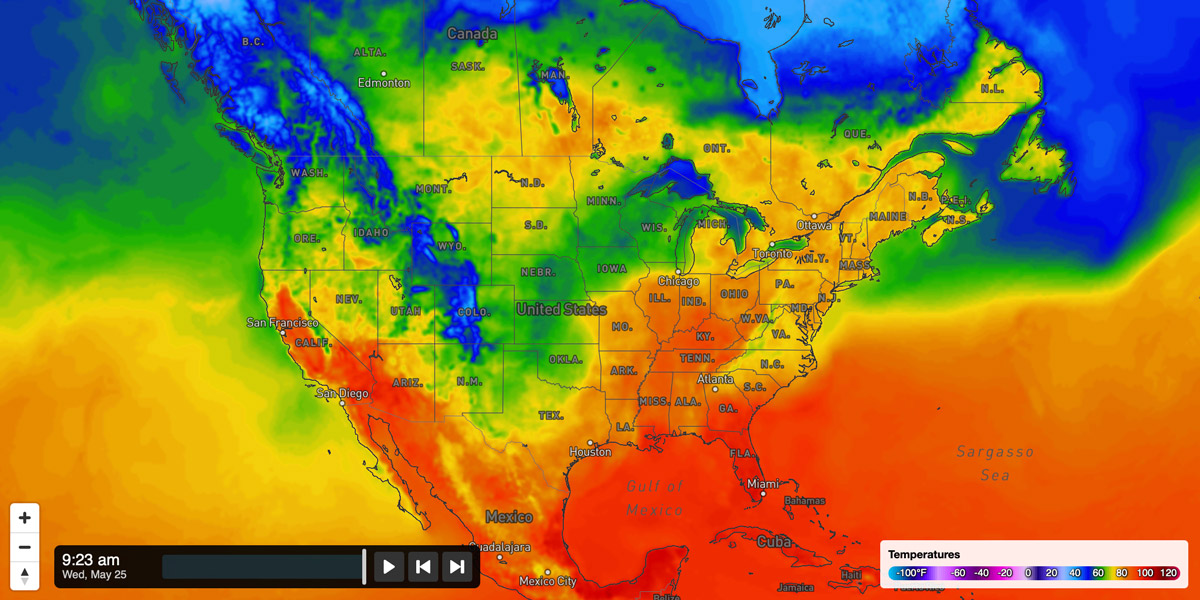
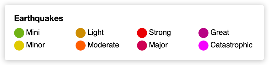
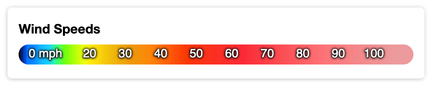
Legends inform the user about what various colors and symbols in a visualization mean. They are especially important in weather visualizations due to the wide variety of data sets, types and units. The Xweather MapsGL SDK includes support for dynamically generating and displaying legends based on a particular configuration which you can then show alongside your interactive weather maps and applications.
Legends can be displayed and managed by a LegendControl instance.
Configuration
The following configuration options are supported when instantiating Legend instances:
{
    id: string;
    type: 'bar' | 'point';
    title: string;
    enabled: boolean;
    width: number;
    insets: number | Array<number>;
    points: Partial<PointLegendOptions>;
    bar: Partial<BarLegendOptions> | Array<Partial<BarLegendOptions>>;
    text: Partial<{
        // text options...
    }>;
}| Option | Description | Default |
|---|---|---|
id | Type: string ()A unique identifier for the legend. | |
type | Type: bar or point ()Determines the type of legend to render. | |
title | Type: string ()Title for the legend, which is usually displayed outside of the legend’s canvas when including it within the context of a larger interface. | |
enabled | Type: boolean (true)Whether the legend is enabled. If false, then the legend will not appear within a parent LegendControl instance. | |
width | Type: number (200)Maximum width of the legend in | |
insets | Type: number or Array<number> ()Internal padding between the canvas edges and the legend content. If a single value is provided, then that inset is applied for all four sides. If an array of two numbers is provided, then the values indicate the horizontal and vertical insets respectively. | |
points | Type: ()Point legend configuration options. See Point Legends below. | |
bar | Type: ()Color scale bar legend configuration options. See Bar Legends below. | |
text | Type: ()Text label configuration options. See Text Labels below. | |
Point Legends
Point configuration options define how a point legend is rendered.
The following configuration options are supported for point legends:
points: {
    values: Array<{ color: string; label: string; }> | ((data?: Record<string, any>) => Promise<Array<{ color: string; label: string; }>>);
    radius: number;
    margin: number | [number, number];
}| Option | Description | Default |
|---|---|---|
radius | Type: number ()Radius of each item’s circle in | |
values | Type: Array<{ color: string; label: string; }> or ((data?: Record<string, any>) => Promise<Array<{ color: string; label: string; }>>) ()An array of items to display in the legend. Each item should provide a valid color string and label value. Alternatively, a callback function can be provided that returns a Promise containing the array of items to display. Using this latter method allows you to dynamically set the legend content based on some remote request or asynchronous process. | |
margin | Type: number or [number, number] ()Outer margin around each item. If a single value is provided, then that margin is applied for all four sides. If an array of two numbers is provided, then the values indicate the horizontal and vertical margins respectively. | |
requiresMapBounds | Type: boolean ()Determines whether the point legend items are based on the visible map bounds. If true and a function is provided for point.values, then the point.values callback function will be triggered each time the visible map region has changed. This allows the legend items to dynamically update based on the current map bounds as needed. | |
Bar Legends
Bar/colorscale configuration options define how a bar legend is rendered.
The following configuration options are supported for bar legends:
bar: {
    height: number;
    rounded: boolean;
    units: LegendUnitProvider;
    measurement: {
        type: string;
        units: string;
        converter?: (value: number, from: string, to: string) => number;
    };
    colorscale: Partial<ColorScaleOptions> & {
        resample?: EasingCurve;
    };
    labels: Partial<{
        values: Array<number | LabelItem> | ((units: string) => Array<number | LabelItem>);
        every: number | ((units: string) => number);
        everyStep: number;
        formatter: (value: number, index: number, state: LegendState) => string;
        placement: 'top' | 'middle' | 'bottom';
        marks: 'point' | 'line' | 'none';
        margin: number | [number, number];
        normalized: boolean;
    }>;
}| Option | Description | Default |
|---|---|---|
height | Type: number ()Height of the color scale bar in | |
rounded | Type: boolean ()Whether the edges of the color scale bar should be rounded. | |
measurement | Type: ()Defines the base measurement type and units for the legend which corresponds to the color scale’s value range. | |
measurement.type | Type: Measurement ()The base measurement type. | |
measurement.units | Type: string ()The base measurement units. | |
measurement.converter | Type: (value: number, from: string, to: string) => number ()A callback function that is responsible for converting a value to the appropriate unit. The from argument is the unit abbreviation the value is provided in. The to argument is the unit abbreviation that the value should be converted to. | |
colorscale | Type: ColorScaleOptions ()Defines the color scale configuration for the bar. See the color scale configuration reference for the supported options. | |
colorscale.resample | Type: EasingCurve ()Easing curve to use when resampling the color scale when non-linear scales are needed. | |
labels | Type: ()Bar value label configuration. | |
labels.values | Type: Array<number | { value: number; label: string; position?: number; }> ()Either an array of values or objects containing values and respective labels to display along the color scale bar. If an array of numbers is provided, then the labels will be rendered according to the string values returned by formatter or the numerical values converted to strings. | |
labels.every | Type: number or (metric: boolean) => number ()Determines how often a label should be automatically rendered along the color scale bar based on the data values. Use this configuration if you just want to show a label every X value rather than having to define your own label array using values above. If you want to use a different interval for Metric and Imperial units, then set this property to a callback function that receives the current metric state as a Boolean and returns the appropriate interval value.Note that labels are designed to not overlap, so the labels that do get rendered in the legend may not always adhere to the interval you specify. | |
labels.everyStep | Type: number ()The number of color scale steps to skip before rendering a label. This is only used if values is not defined. | |
labels.formatter | Type: (value: number, index: number, state: Record<string, any>) => string ()A callback function that receives a value, its label index in the array and the current render state and is responsible for returning the desired label string to render. | |
labels.placement | Type: top, middle or bottom ()Vertical label placement relative to the color scale bar. | |
labels.marks | Type: point, line or none ()Type of marks to render at each label position, if desired. | |
labels.margin | Type: number or [number, number] ()Horizontal and vertical margins around text labels. | |
Text Labels
Text configuration options define how text labels will be rendered on the legend.
text: {
    family: string;
    color: string;
    stroke: Partial<{
        color: string;
        width: number;
    }>;
    size: number;
    style: 'normal' | 'italic';
    weight: 'normal' | 'bold' | 'bolder' | 'lighter';
    offset: Partial<{ x: number; y: number; }>;
    shadow: Partial<{
        color: string;
        blur: number;
        offset: Partial<{ x: number; y: number; }>;
    }>;
}| Option | Description | Default |
|---|---|---|
family | Type: string ()Font family to use when rendering text. | |
color | Type: string ()Text color. | |
stroke | Type: ()Text stroke options. | |
stroke.color | Type: string ()Color of the text’s outer stroke. | |
stroke.width | Type: number ()Width of the text’s outer stroke. | |
size | Type: number ()Font size of the text. | |
style | Type: normal or italic ()Text style. | |
weight | Type: normal, bold, bolder or lighter ()Text weight. | |
offset | Type: { x: number; y: number; } ()Horizontal and vertical offsets relative to their position for text labels. | |
shadow | Type: ()Text shadow options. | |
shadow.color | Type: string ()Text shadow color. | |
shadow.blur | Type: number ()Amount of blur to apply to the shadow. | |
shadow.offset | Type: { x: number; y: number; } ()Horizontal and vertical shadow offset. | |
Properties
The following properties are available on Legend instances:
| Option | Description | Default |
|---|---|---|
type | Type: point or bar (read-only)The type of legend. | |
measurement | Type: Measurement or undefined (read-only)The measurement type for the legend. Returns undefined for point legends. | |
size | Type: { width: number; height: number; } (read-only)Size of the legend canvas. | |
canvas | Type: HTMLCanvasElement (read-only)Legend canvas element containing the rendering context. | |
Methods
The following methods are available on Legend instances:
Rendering and Updating
render(state?: Record<string, any>)update(options: Partial<LegendOptions>, state?: Record<string, any>)Events
The following events are triggered by Legend instances.
update