JavaScript SDK - Info Panel
An interactive map application contains an info panel component, which is used to display additional content related to a specific geographical coordinate/location or map element, such as a selected marker or polygon. An info panel contains built-in section views for basic weather information like observations and forecasts, but is fully extensible so you can provide your own views and content as needed.
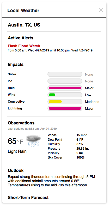
Example info panel
If you’re creating an InfoPanel instance directly, such as for use outside of InteractiveMapApp, use the following code to create an info panel and link it with your InteractiveMap instance:
const target = document.getElementById('map-search');

// custom configuration options for the panel
const panelConfig = {};
const panel = new PlaceSearchPanel(panelConfig);

// `map` is an instance of InteractiveMap
// update the map center when a location is selected from the results
panel.on('select', (e) => {
    // get the selected location's coordinate info from the event data
    const { result: { loc }} = e.data || {};
    if (loc) {
        const { lat, long: lon } = loc;
        const coord = { lat, lon };
        map.setView(coord, 8);
    }
});

// add the panel to the DOM
panel.addTo(target);

// show the panel using a configured view (e.g. "localweather") when the map is clicked
map.on('click', (e) => {
    const { coord: { lat, lon }} = e.data || {};
    // 'localweather' is a content view we've configured on our InfoPanel
    panel.showContent('localweather', 'Local Weather').load({
        p: `${lat},${lon}`
    });
});
Refer to the Using Content Views section below and our custom info panel content example for more information about setting up your info panel’s content views.
If you’re using an instance of InteractiveMapApp, you don’t have to use the above code since the info panel is already instantiated and managed for you.
Configuration
The following options are supported when configuring your InfoPanel instance:
| Option | Type | Description | Default |
|---|---|---|---|
| views | object | An object containing the view configurations keyed by view identifier. Content views contain one or more section views and are used when displaying content within an info panel. An info panel will display a single content view at once. See the Content View Configuration section below for more information. | |
| sections | object | An object containing the section view configurations keyed by section identifier. View sections represent data for a single data type and are used within content views when rendering an info panel’s content. See the View Section Configuration section below for more information. | |
| title | string | Label title for the panel. The title is only rendered if the panel is toggleable and in the expanded state. | |
| metric | boolean | Whether the info panel views should be configured to display Metric units by default. Default value is false. | |
| className | string | A CSS class name to add to the panel, which can be used for additional style customizations. | |
| toggleable | boolean | A boolean value indicating whether the panel is toggleable. A toggleable panel will display a button in the closed/collapsed state initially. Clicking on the button will expand the panel to its full size. | false |
| icon | string | Icon HTML to display in the button when the panel is collapsed. This value can be any valid HTML, including an <img> or <svg> element. | |
| position | object | Options to configure the position of the panel within its parent container. | |
| position.pin | string | The position to pin the panel to relative to its parent container. Supports topleft, top, topright, left, center, right, bottomleft, bottom, or bottomleft. | |
| position.translate | IPoint | Amount to translate the panel in the x and y axis relative to its pinned position. | { x: 0, y: 0 } |
Content View Configuration
Content views contain one or more section views and are used when displaying content within an info panel. The following options define the configuration for a content view:
| Option | Type | Description | Default |
|---|---|---|---|
| views | object[] | An array of section view configurations or section view keys to render as part of this content view. The order in which they appear in the array is the order in which the will be rendered in the info panel. See the View Section Configuration section below for more information. | |
| data | object | xxxxx | |
| request | ApiRequest or Function | The ApiRequest to use when loading data for this content view. The request should load all data that is required by all section views. This value can either be a request instance or a function that configures and returns a request instance. |
View Section Configuration
View sections represent data for a single data type and are used within content views when rendering an info panel’s content. The following options define the configuration for a section view:
| Option | Type | Description |
|---|---|---|
| title | string | View title. If provided, the title will be rendered at the top of the view section’s container. |
| data | object or Function | The data to use when rendering the view section. If a function is provided, the full data set from the parent content view will be passed as an argument and the function must return the specific data required for rendering this view section. |
| renderer | string or Function | The section renderer, which can either be an HTML string or a function that receives the view’s data as an argument and returns the final HTML for the view. |
| init | Function | A callback function that is called when the view is rendered and added to the DOM to allow you to perform any additional setup on render. This callback function receives two parameters: the view instance and the parent content view that contains the view. |
| requiresData | boolean | If true, then this view will only be rendered in the parent content view if valid data was returned by the data property or function. When false, the view will be rendered regardless if data is available for the view. Default value is false. |
| static | boolean | Determines if the view should be treated as a static view, meaning it will only be rendered once initially and any updates to the parent content view will not re-render this view. Default value is false. |
Default Configuration
The following is the default configuration object for a InfoPanel instance:
{
    views: undefined,
    sections: undefined
}
Also review the default configuration for an InteractiveMapApp instance that is applied to its internal info panel.
Built-in View Sections
A series of section views are already setup and configured for you for basic weather information, like observations, advisories, forecasts and threats. The following section views can be used within your own content view configurations:
| Key | Description |
|---|---|
| units | Displays an Imperial/Metric units toggle control to switch the active info panel units at runtime. |
| place | Displays the formatted place name. |
| obs | Displays the latest observation information for the place. |
| forecast | Displays either an hourly or daily forecast for the place. |
| alerts | Displays the currently active weather alerts for the place. |
| threats | Displays the current weather threats for the place. |
| outlook | Displays a short-term outlook phase for the place. |
| hazards | Displays a series of weather hazard and their impacts for the place. |
As an example, the following is the configuration for the built-in place section view:
{
    data: (data) => {
        if (!data) return null;

        data = data.places || data;
        return data.place;
    },
    renderer: (data) => {
        return (`
            <div class="place">
                <p class="name">${data.name}${!isEmpty(data.state) ? `, ${data.state}` : ''}, ${data.country}</p>
            </div>
        `);
    }
}
In the above place section view, the data property receives the full data set from the parent content view and returns just the data required for the view. The renderer function then receives this filtered data and outputs the final HTML snippet for this section view within the context of the parent content view.
Handling Units
Oftentimes when outputting numerical data values you’ll want to display them in terms of a particular unit of measurement, such as temperature or pressure. You can handle this in your view’s renderer function by accessing the units property that’s automatically added to the data object provided to your renderer. This units property will either be a value of imperial or metric:
{
renderer: (data) => {
const metric = data.units === 'metric';
return (`
<div class="temp">
The current temperature is ${metric ? `${data.tempC}°F` : `${data.tempF}°C`}.
</div>
`);
}
}You can then output the correct value that corresponds to the current units value associated with the parent info panel instance. When the current units value changes from the info panel, then your views will automatically be re-rendered to allow you to update the data values based on the active units value.
Using Content Views
Since an info panel’s content view consists of one or more section views, you can piece together your content views using the above built-in section views, your custom section views, or a combination of both. Simply provide your custom section and content view configurations within the sections and views properties of your info panel’s main configuration object.
An InteractiveMapApp instance also configures a default local weather content view that can be used for displaying weather information for a single location or coordinate.
Configuring a Content View
The following is the views configuration containing the general local weather content view that’s built into InteractiveMapApp for displaying local weather information for a particular location:
{
    views: {
        localweather: {
            request: () => {
                // main batch request instance
                const request = aeris.api();

                // add a request for all data we need for each section in the content view
                const forecastFields = `timestamp,dateTimeISO,tempF,tempC,icon,weatherPrimary,windSpeedMPH,windSpeedKPH,windSpeedMinMPH,windSpeedMinKPH,
                    windSpeedMaxMPH,windSpeedMaxKPH,windGustMPH,windGustKPH,snowIN,snowCM,precipIN,precipMM`.split(',').map((key) => `periods.${key}`);
                request.addRequest(aeris.api().endpoint('forecasts').fields(forecastFields.join(',')).filter('3hr').limit(7));

                request.addRequest(aeris.api().endpoint('places'));
                request.addRequest(aeris.api().endpoint('threats').radius('50mi'));
                request.addRequest(aeris.api().endpoint('alerts').fields('details.type,details.name,timestamps'));
                request.addRequest(aeris.api().endpoint('phrases/summary'));
                request.addRequest(aeris.api().endpoint('observations'));
                request.addRequest(aeris.api().endpoint('convective/outlook').action(ApiAction.CONTAINS));
                request.addRequest(aeris.api().endpoint('lightning/summary').action(ApiAction.CLOSEST).radius('60mi').limit(100));

                return request;
            },
            views: [{
                renderer: 'place'
            },{
                title: 'Active Threats',
                renderer: 'threats'
            },{
                title: 'Active Alerts',
                renderer: 'alerts'
            },{
                title: 'Impacts',
                renderer: 'hazards'
            },{
                title: 'Observations',
                renderer: 'obs'
            },{
                title: 'Outlook',
                renderer: 'outlook'
            },{
                title: 'Short-Term Forecast',
                renderer: 'forecast'
            }]
        }
    }
}
As demonstrated in the above example, when configuring a content view you must provide an array of section views to display and either the request to use for the view’s data or the static data to use when rendering the view. This local weather content view uses all of the built-in section views that come with the SDK, so the renderer property values are just the section view keys documented above.
Refer to our examples section for more examples of creating custom section and content views for your info panel.
Showing Info Panel Content
Once you’ve configured your info panel’s section and content views, you can show your map application’s info panel using one of the configured content views easily using the showInfo() or showInfoAtCoord() method on your interactive map app instance.
At minimum, both methods require the content view key to render when showing the info panel. You can also provide a title to display in the title bar of the info panel and/or the static data to use when rendering the content view.
For instance, to show the built-in local weather content view for the coordinate where the map is clicked with a title of “Local Weather”:
app.map.on('click', (e) => {
    // the coordinate where the map was clicked is stored in the event
    // data, 'e.data.coord'
    app.showInfoAtCoord(e.data.coord, 'localweather', 'Local Weather');
});
The data will automatically be requested using the specified coordinate and the request configured for the content view.
If you’re displaying content for a specific geographical coordinate, use showInfoAtCoord(). This method will automatically perform the configured request using the coordinate provided when called. However, if your content view needs to pass request parameters other than just the coordinate when loading its required data, use showInfo(). When using showInfo(), the associated info panel instance is returned and you are required to call load() with any request parameters your content view’s request requires.
For example, if we’ve added a custom airports vector source to the map to display the current flight rules at major airports, we’d want to display additional information for an airport when clicking its marker on the map. We would then configure our info panel with a custom airport content view to use when an airport is selected. Since this related to airports and not a coordinate, we need to pass the airport code to the content view’s request using showInfo() and then calling load():
app.map.on('marker:click', (e) => {
    const data = e.data.data || {};

    // check the source key that triggered the click event to make sure
    // we're only showing the info panel for airport markers
    const source = data.awxjs_source;
    if (source === 'airports') {
        const id = data.id;
        const place = data.place || {};
        const name = aeris.utils.strings.toName(place.name);
        app.showInfo('airport', `${id} - ${name}`).load({ p: id });
    }
});
In this example, the info panel will be shown and rendered immediately with the airport ICAO code and name displayed in the title bar. Instead of the airport content view being rendered at first, a loading indicator is displayed while the request for data is being made via our call to load(). Once data has loaded, the airport content view is rendered with the data and the info panel updates its content.
Refer to our collection of examples for complete demonstrations of creating and working with custom content views.